
DIGIPAK DESIGNS
Design 1

This first design shows images of the front and back cover of the CD. The front cover shows the image of the band on the front cover smiling and having a good time which is something seen quite commonly on Pop bands CD's. For example, this is seen in One Direction's Up All Night album and GRL's album cover for the single 'Vacation.' We have used popular colours from the pop culture such as pinks, oranges and yellow which all imply the theme of joyfulness and cheer which is a common theme across the video we wish to create. As well as this, most pop albums consist of the band or artist on the front which is also something we want to interpret into our digipak designs. In the case of Little Mix, the band and their music are what sells the CD so it only seems fitting to have them on the front and back cover. In addition, for the younger audience they may appeal to, when looking in a shop, the young audience may only look for the faces of the band as that is what they will recognise.
Design 2
The second design of the digipak shows the band members on the front of the CD dressed in a similar colour of outfit to make them look like a real band. One the back cover we decided to use the colour pink which is also seen in the band's outfits. This ties together the theme of the album making it look genuine and relatable to each side of the CD. This is our favourite design out of the three. We wish to create this design as it fits well with the use of the bright colours seen within the pop culture. The vibrant colours also make the album stand out amongst others which is something a pop album should be to make it unique to the rest and other genres. As well as this, the fact that the band members are featured on a lot of the sides of the album are useful as this is also seen commonly within the genre to have their artist as the main selling point. The actual font of the song title 'Dear lover' is elegant and thin representing somebodies handwriting which makes the story of writing a letter to a lover more personal.


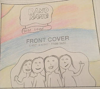
Design 3
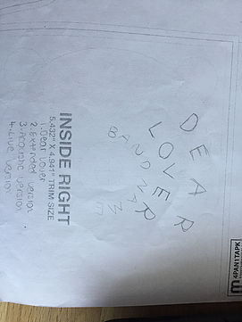


The third design consists of the band on the front cover again which is almost always seen on an album for a girlband. This is because the band is the main selling point of the album and them and their music are the reason people buy the CD. On this design, the band name is bigger than the actual song title. This also supports the point that the band sell the CD with their strong, independent image and friendship. the colours used on the front cover are mainly blue and purple which correspond with the colours of the girl's outfits. These colours suggest elements of power, dignity and loyalty which is also shown through the girl's friendship. Furthermore, the letter image on the inside left of the cover makes the audience remember the relationship element of the storyline adding to the romance within the story. In addition, the inside right consists of the CD which contains a curved structure of writing of the album title and band name. This adds distinctiveness to the album and makes the artwork look even more effective and unique. This sunset has been used on the back cover as they are seen multiple times on the green screen in the video, showing the correspondence between the video and album.